Introduction
A professional event website plays a critical role in promoting conferences, seminars, business summits, workshops, corporate gatherings, and networking events. Before registering for an event, most attendees visit the official website to learn about speakers, schedules, venue details, and event highlights.
According to industry reports, more than 70% of event attendees research an event online before making a registration decision. This makes a well-designed event website one of the most important digital assets for event organizers.
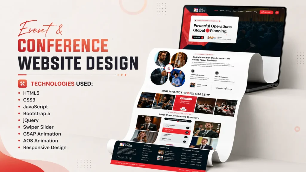
If you are looking for a modern Event & Conference Website Template built using HTML, CSS, JavaScript, Bootstrap 5, GSAP Animation, and Swiper Slider, this frontend project showcase is worth exploring. The template features a clean user interface, responsive design, smooth animations, speaker profiles, event schedules, blog sections, and mobile-friendly navigation.
Whether you are a frontend developer, web design student, freelancer, agency owner, or someone looking for inspiration for an event management website, this project demonstrates modern frontend development techniques and professional UI design practices.
Project Overview
This Event & Conference Website Template is designed specifically for modern events and professional conferences. The template combines attractive visuals with practical functionality, creating an engaging user experience across all devices.
The project follows modern web development standards and includes responsive layouts, interactive sections, animation effects, and user-friendly navigation.
Project Information
| Feature | Details |
|---|---|
| Project Type | Event & Conference Website |
| Design Style | Modern & Professional |
| Layout | One Page Responsive Design |
| Framework | Bootstrap 5 |
| Technologies | HTML5, CSS3, JavaScript |
| Animations | GSAP & AOS |
| Slider | Swiper Slider |
| Mobile Friendly | Yes |
| SEO-Friendly Structure | Yes |
The template is suitable for conferences, workshops, webinars, business events, seminars, expos, and networking programs.
Key Features of This Event Website Template
One of the strongest aspects of this project is its feature-rich design. Instead of focusing only on visual appearance, the template also prioritizes usability and user engagement.
Modern Hero Section
The homepage starts with a visually attractive hero banner that instantly captures visitor attention.
Features include:
- Event title and tagline
- Call-to-action buttons
- Background visuals
- Animation effects
- Professional layout
The hero section helps create a strong first impression and encourages visitors to explore further.
Sticky Navigation Menu
A sticky header improves website usability by keeping navigation accessible while scrolling.
Benefits include:
- Better user experience
- Faster navigation
- Improved engagement
- Mobile accessibility
Event Schedule Section
Event schedules are often the most visited part of conference websites.
This template includes:
- Session timelines
- Event agenda
- Speaker schedules
- Organized content layout
Visitors can quickly find important event information without confusion.
Speaker Showcase Section
Professional speaker presentation helps build trust and credibility.
Features include:
- Speaker images
- Designations
- Social media integration
- Interactive layouts
Blog Section
The integrated blog area allows organizers to publish:
- Event announcements
- Industry insights
- Speaker updates
- Conference news
This helps improve SEO performance while keeping attendees informed.
Search Popup
The template includes a search functionality that improves content discoverability and enhances the overall user experience.
Responsive Mobile Navigation
Modern websites must perform well across all screen sizes.
This template includes:
- Mobile menu
- Touch-friendly navigation
- Responsive layouts
- Optimized spacing
Technologies Used
The template is powered by several modern frontend technologies that work together to create a professional user experience.
HTML5
HTML5 forms the foundation of the website.
Advantages include:
- Semantic structure
- Improved SEO
- Better accessibility
- Cross-browser compatibility
The use of semantic elements helps search engines better understand page content.
CSS3
CSS3 is responsible for the visual styling and layout.
Features include:
- Modern typography
- Responsive layouts
- Hover effects
- Visual consistency
- Advanced styling
The design follows current UI trends while maintaining excellent readability.
JavaScript
JavaScript adds dynamic functionality and interactivity.
Functions include:
- Navigation controls
- Interactive effects
- User interactions
- Dynamic elements
These features improve engagement and overall user experience.
Bootstrap 5
Bootstrap 5 helps create responsive layouts efficiently.
Benefits:
- Mobile-first design
- Flexible grid system
- Reusable components
- Faster development
Bootstrap ensures the website looks professional across multiple devices.
GSAP Animation
GSAP is used to create smooth animations throughout the website.
Advantages:
- High-performance animations
- Professional visual effects
- Better engagement
- Smooth transitions
Swiper Slider
Swiper Slider powers modern carousel sections.
Features include:
- Responsive sliders
- Touch support
- Smooth transitions
- Mobile optimization
Homepage Sections Explained
Understanding how the homepage is structured can help developers learn modern website design practices.
Hero Banner
The hero banner serves as the focal point of the homepage.
It typically includes:
- Event branding
- Main message
- CTA buttons
- Visual elements
A strong hero section significantly improves user engagement.
About Event Section
The about section explains:
- Event objectives
- Event highlights
- Benefits of participation
- Key information
This section helps users understand why the event matters.
Services Section
The services section highlights event offerings and attendee benefits.
Examples include:
- Networking opportunities
- Workshops
- Business sessions
- Industry discussions
Event Schedule Section
A dedicated schedule area improves organization and accessibility.
Visitors can quickly review:
- Session timings
- Agenda details
- Program flow
Speakers Section
The speaker section builds authority and trust.
Modern event websites use this section to showcase industry experts and keynote speakers.
Blog Section
The blog area supports content marketing efforts and helps improve organic visibility.
Publishing relevant content can attract search traffic and increase engagement.
Responsive Design Benefits
Responsive design is essential in modern web development.
Recent studies indicate that more than 60% of global website traffic originates from mobile devices. Websites that fail to provide a mobile-friendly experience risk losing a significant portion of their audience.
This template is optimized for:
Desktop Devices
Desktop users benefit from:
- Large layouts
- Enhanced visuals
- Better content presentation
Tablets
Tablet optimization ensures:
- Comfortable navigation
- Balanced layouts
- Better readability
Smartphones
Mobile users enjoy:
- Responsive menus
- Touch-friendly elements
- Faster interactions
This multi-device compatibility improves accessibility and user satisfaction.
Source Code Structure
The project follows a clean and organized folder structure, making customization easier.
Project Structure
project-folder/

├── index.html
├── assets/
│
├── css/
│   ├── style.css
│   └── responsive.css
│
├── js/
│   ├── script.js
│   └── plugins.js
│
├── images/
│
├── fonts/
│
└── vendor/
A structured codebase helps developers maintain and scale projects more efficiently.
Why Frontend Developers Should Explore This Project
Many beginners struggle to understand how professional websites are built.
This template provides practical exposure to:
Real-World Project Structure
Developers can learn:
- File organization
- Component hierarchy
- Responsive implementation
Responsive Design Techniques
The project demonstrates how modern websites adapt across different devices.
Animation Integration
Developers can study how GSAP and scroll-based animations enhance user engagement.
UI Consistency
Consistent spacing, typography, and visual hierarchy are important aspects of professional design.
SEO-Friendly Development Approach
Search engine optimization starts with proper development practices.
This template follows several SEO-friendly principles.
Semantic HTML Structure
Semantic elements help search engines understand content more effectively.
Examples include:
- Header
- Section
- Article
- Footer
Proper Heading Hierarchy
The template follows a logical heading structure:
- H1 for main page title
- H2 for major sections
- H3 for supporting content
This improves readability and crawlability.
Performance Optimization
Fast-loading websites generally provide better user experiences.
Optimized frontend practices contribute to:
- Better engagement
- Reduced bounce rates
- Improved Core Web Vitals
How to Customize This Event Website Template
Customizing the template is straightforward.
Step 1: Download the Source Code
Download the project files and extract the folder.
Step 2: Open the Project
Open the project in your preferred code editor.
Examples:
- VS Code
- Sublime Text
- WebStorm
Step 3: Update Content
Replace:
- Event name
- Event description
- Speaker information
- Dates and schedules
- Images
Step 4: Customize Colors and Branding
Update CSS styles to match your event branding.
Step 5: Test Responsiveness
Review the design across:
- Mobile devices
- Tablets
- Desktop screens
Who Can Use This Template?
This project is ideal for various users.
Frontend Developers
Learn modern development techniques and UI implementation.
Students
Understand real-world project structures and responsive design practices.
Freelancers
Use the template as inspiration for client projects.
Event Organizers
Create professional websites for conferences and events.
Agencies
Speed up event website development and design workflows.
What Makes This Template Stand Out?
Many event website templates focus only on visual design. This project balances design, performance, and usability.
Professional Layout
The design creates a premium impression from the first visit.
User-Focused Navigation
Visitors can quickly find important information.
Smooth Animations
Animations improve engagement without affecting usability.
Mobile Optimization
The responsive design ensures a consistent experience across devices.
Modern UI Design
The template follows contemporary web design standards and trends.
Download Event & Conference Website Source Code
If you are looking for a modern Event & Conference Website Template using HTML, CSS, JavaScript, Bootstrap 5, GSAP Animation, and Swiper Slider, this project offers an excellent frontend development reference.
The source code includes:
- HTML Files
- CSS Files
- JavaScript Files
- Images
- Fonts
- Animation Assets
- Responsive Components
Whether your goal is learning frontend development or building an event website, this project provides valuable insights into professional web design.
Conclusion
A modern Event & Conference Website plays a crucial role in promoting events, engaging attendees, and improving registration conversions. This frontend project showcases how HTML, CSS, JavaScript, Bootstrap 5, GSAP Animation, and Swiper Slider can be combined to create a professional and responsive event website.
From the hero section and speaker showcase to event schedules and responsive navigation, every component has been designed to deliver an engaging user experience. Developers can learn valuable frontend techniques, while event organizers can gain inspiration for building effective conference websites.
If you are searching for a responsive event website template with clean code, modern UI design, smooth animations, and professional structure, this project is an excellent example of contemporary frontend development.
FAQs
What is an Event & Conference Website Template?
An Event & Conference Website Template is a pre-designed website layout created for conferences, seminars, workshops, expos, and business events.
Which technologies are used in this project?
The project uses HTML5, CSS3, JavaScript, Bootstrap 5, GSAP Animation, AOS Animation, and Swiper Slider.
Is the template responsive?
Yes. The website is fully responsive and optimized for desktops, tablets, and smartphones.
Can beginners learn from this source code?
Yes. The project structure is beginner-friendly and demonstrates modern frontend development techniques.
Can I customize the design?
Yes. You can modify colors, content, images, layouts, and branding according to your requirements.
Why is responsive design important for event websites?
Responsive design ensures visitors can access event information comfortably from any device, improving user experience and engagement.
Does the template include animation effects?
Yes. The project includes GSAP and AOS animations to create smooth and interactive user experiences.
Who should use this Event Website Template?
Frontend developers, students, freelancers, agencies, and event organizers can all benefit from this project.
Related Website Templates You Should Explore
Admin Dashboard Template HTML CSS JavaScript – Modern Multipurpose Admin Dashboard UI
Create Responsive Autoplay Carousel using HTML CSS and JavaScript
107 people bought this
Grab it Now for Just 499 ₹999