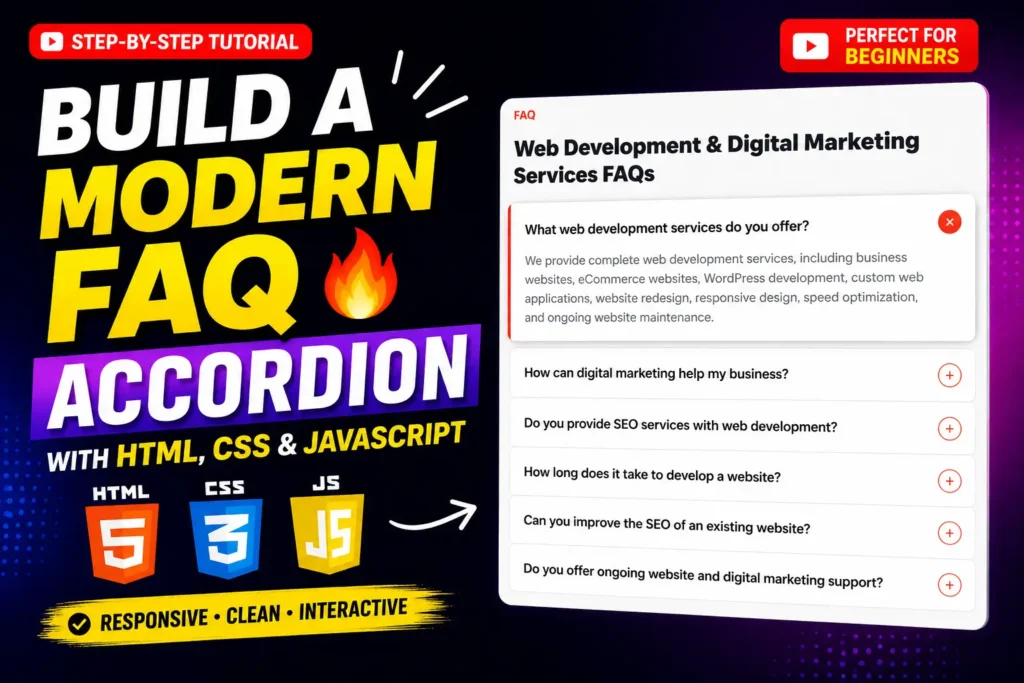
A well-designed FAQ section can make a website easier to navigate while keeping important information organized in a compact space. Instead of displaying every answer at once, an FAQ Accordion lets visitors click a question to reveal its answer and collapse it when they are finished.
In this tutorial, we explore a Modern FAQ Accordion with HTML CSS JavaScript and explain how the complete interface works. The project combines semantic HTML structure, clean CSS styling, SVG icons, and a small JavaScript function to create an interactive accordion component.
The project is particularly useful for business websites, agency websites, landing pages, service websites, portfolios, documentation pages, and other frontend projects where several questions need to be presented without making the page unnecessarily long.
There is also a practical reason to pay attention to accessible UI components. WebAIM’s 2026 Million report found detectable WCAG 2 failures on 95.9% of the top one million home pages it analyzed. The report also found low-contrast text on 83.9% of pages, making accessibility and readable interface design important considerations even for relatively small components.
This FAQ accordion project is therefore not only about making a page look modern. It is also a useful frontend exercise for understanding interaction, responsive layout, visual states, and accessibility attributes.
What Is an FAQ Accordion?
An FAQ accordion is an interactive interface component that displays a list of frequently asked questions. Each question acts as a control that can reveal or hide its corresponding answer.
For example, a website may have questions such as:
- What web development services do you offer?
- How can digital marketing help my business?
- Do you provide SEO services?
- How long does website development take?
- Can you improve the SEO of an existing website?
- Do you provide ongoing website support?
Displaying all six answers simultaneously can make the page considerably longer. An accordion solves this problem by allowing the visitor to open only the information they want to read.
According to the W3C’s ARIA Authoring Practices Guide, an accordion is a vertically stacked collection of interactive headings whose controls reveal or hide associated content. The pattern is commonly used to reduce scrolling when presenting multiple sections of information.
Project Overview
The project in this article uses three main technologies:
| Technology | Purpose |
|---|---|
| HTML5 | Creates the FAQ structure and content |
| CSS3 | Handles layout, typography, colors, spacing, icons and transitions |
| JavaScript | Controls opening and closing of FAQ items |
The project does not require a JavaScript framework or a large UI library. That makes it a useful example for beginners who want to understand how interactive frontend components work using core web technologies.
The visual design uses a centered content area with a maximum width of 720px, a light page background, a white FAQ card, rounded corners, subtle separators, and a warm accent color for the interactive icon.
Why Use an FAQ Accordion on a Website?
An FAQ accordion can improve the presentation of information when used correctly.
1. It Reduces Visual Clutter
Showing a long list of questions and answers can make a page feel overwhelming. An accordion keeps the initial interface compact.
2. It Improves Content Scanning
Visitors can quickly scan the questions and choose the answer that is relevant to them.
3. It Works Well on Mobile
Long pages are particularly inconvenient on smaller screens. Collapsible content can reduce unnecessary scrolling.
4. It Creates an Interactive Experience
A simple click interaction makes the FAQ section feel more polished than a static list of paragraphs.
5. It Can Support Service Pages
Businesses can use FAQ sections to answer questions about services, timelines, processes, pricing structures, technical requirements, support, and other common concerns.
However, an accordion should not be used simply because it looks modern. If an answer is essential to understanding a page, hiding it behind an interaction may not always be the best choice.
HTML Structure of the FAQ Accordion
The HTML creates the basic structure of the component.
At the top of the page, the project includes an eyebrow label:
FAQ
This is followed by the main heading:
Web Development & Digital Marketing Services FAQs
The FAQ content is then placed inside a .faq-card container.
Each individual question is wrapped in a .faq-row. Inside that row, the .faq-header button contains the question text and the icon.
The answer is placed inside a .faq-body container.
The basic hierarchy looks like this:
.wrap
 ├── .eyebrow
 ├── h1
 └── .faq-card
      ├── .faq-row
      │    ├── .faq-header
      │    └── .faq-body
      ├── .faq-row
      │    ├── .faq-header
      │    └── .faq-body
      └── ...
Using a button for the interactive FAQ header is an important implementation detail. Users should be able to identify and operate the control as an interactive element rather than relying on a generic div.
The project also uses aria-expanded to communicate whether an FAQ item is currently open or closed.
For example:
<button class="faq-header" aria-expanded="true">
When the FAQ is closed, the value changes to:
aria-expanded="false"
The W3C accordion pattern recommends using aria-expanded to communicate the expanded state and aria-controls to identify the associated content panel.
How the CSS Creates the Modern FAQ UI
The CSS is intentionally simple but uses several techniques that make the component look polished.
Centered Responsive Container
The .wrap element uses:
max-width: 720px;
margin: 0 auto;
This keeps the FAQ readable on large screens while allowing the container to shrink on smaller devices.
The body also uses horizontal padding:
padding: 40px 20px;
This prevents the content from touching the screen edges on mobile devices.
Clean Typography
The project uses a system font stack:
font-family: -apple-system, BlinkMacSystemFont, "Segoe UI",
Roboto, Helvetica, Arial, sans-serif;
This approach avoids depending on an external font service and allows the browser to use a familiar system font.
FAQ Card Design
The main FAQ container uses a white background with rounded corners:
.faq-card {
  background: #ffffff;
  border-radius: 16px;
  overflow: hidden;
}
The result is a clean card-style interface that works well for modern business and service websites.
Question Rows
Each FAQ question uses a transparent button with flexible alignment:
display: flex;
align-items: center;
justify-content: space-between;
This places the question on the left and the interactive icon on the right.
Plus and X Icons
The project uses inline SVG icons rather than external icon libraries.
When the FAQ is closed, the plus icon is displayed.
When the FAQ opens, the plus icon disappears and the X icon becomes visible.
This provides an immediate visual indication of the component’s state.
How the JavaScript FAQ Interaction Works
The interactive behavior is controlled by a small JavaScript function called toggleFaq().
The function receives the clicked button:
function toggleFaq(btn) {
It then finds the parent .faq-row:
var row = btn.parentElement;
Next, it checks whether that FAQ is already open:
var isOpen = row.classList.contains('open');
The important part of the implementation is that the script first closes every FAQ row:
document.querySelectorAll('.faq-row').forEach(function(r) {
  r.classList.remove('open');
  r.querySelector('.faq-header')
    .setAttribute('aria-expanded', 'false');
});
After closing all rows, the script checks whether the clicked item was previously closed.
If it was closed, the script opens it:
if (!isOpen) {
  row.classList.add('open');
  btn.setAttribute('aria-expanded', 'true');
}
This creates a single-open accordion behavior.
In other words, when a visitor opens another question, the previously open question automatically closes.
That behavior is particularly useful when you want the interface to remain compact.
How the FAQ Animation Works
The accordion does not require a JavaScript animation library.
Instead, CSS controls the opening effect using max-height and transition.
The closed state uses:
max-height: 0;
overflow: hidden;
The open state changes the maximum height:
max-height: 300px;
A transition is then applied:
transition: max-height 0.2s ease, padding 0.2s ease;
This creates a short expansion and collapse effect.
One thing developers should consider when adapting this technique is answer length. The current project uses a fixed maximum height of 300px. If you add significantly longer answers, that value may need to be increased or the animation approach may need to be changed.
FAQ Accordion Accessibility Considerations
Accessibility is one of the areas that developers often overlook when creating interactive UI components.
A visually attractive accordion is not necessarily accessible.
The current project already uses a useful accessibility attribute:
aria-expanded="true"
and updates it dynamically when the state changes.
For a more robust production implementation, you can also connect each button to its corresponding answer panel using aria-controls.
For example:
<button
  aria-expanded="false"
  aria-controls="faq-answer-1">
and:
<div id="faq-answer-1">
This relationship helps assistive technologies understand which content is controlled by the button.
The W3C recommends that accordion implementations communicate the expanded state and relationship between the header control and associated panel. It also documents keyboard interaction such as using Enter or Space to operate the accordion header.
The W3C also warns that accessibility implementations should be tested with actual assistive technologies because support can vary between browsers and assistive technology combinations.
A Practical Accessibility Checklist
When customizing this FAQ component, consider the following:
- Use a real
<button>for interactive controls. - Keep question text descriptive.
- Maintain sufficient color contrast.
- Make sure keyboard users can reach the controls.
- Keep visible focus states.
- Update
aria-expandedwhenever the state changes. - Consider using
aria-controls. - Test the component with keyboard navigation.
- Test the component at different screen sizes.
- Avoid hiding important information only because an accordion is visually convenient.
These details matter because WebAIM’s 2026 research found low-contrast text on 83.9% of the top one million home pages analyzed.
What Makes This FAQ Accordion Different?
Many basic FAQ examples focus only on the JavaScript click function. This project takes a slightly broader approach by combining visual design, interaction, and state management.
Here are some details worth noticing.
Single-Open Behavior
Only one FAQ answer remains open at a time. This prevents the component from becoming excessively tall.
State-Based Icon Design
The plus and X icons are controlled through the .open class rather than requiring JavaScript to manually manipulate every SVG.
No Large Dependency
The component relies on HTML, CSS, and vanilla JavaScript. This keeps the implementation easy to understand.
Responsive Layout
The 720px content width and 20px body padding provide a sensible foundation for desktop and mobile layouts.
Reusable Structure
You can replace the questions and answers without changing the core accordion logic.
How to Customize the FAQ Accordion
One of the biggest advantages of a small source-code project is how easy it is to adapt.
Change the Main Heading
Replace:
Web Development & Digital Marketing Services FAQs
with a heading that matches your website.
For example:
Frequently Asked Questions About Our Services
Change the Questions
The existing six questions can be replaced with questions related to your industry.
For an eCommerce website, you might use:
- What payment methods do you accept?
- How long does shipping take?
- Can I track my order?
- What is your return process?
For a software company, questions could cover integrations, account setup, support, security, and technical requirements.
Change the Accent Color
The current design uses an orange-red accent. You can change the colors used for the icon border, active icon, and eyebrow text to match your website’s brand.
Adjust Border Radius
The FAQ card uses a 16px radius. A smaller value can produce a sharper corporate appearance, while a larger value can create a softer modern interface.
Adjust Spacing
The .faq-header contains:
padding: 22px 24px;
You can increase or reduce this value depending on how compact you want the FAQ section to feel.
How to Add More FAQ Items
Adding another FAQ is straightforward.
Duplicate an existing .faq-row, then replace the question and answer.
The JavaScript does not need to be rewritten because it automatically selects all elements matching:
document.querySelectorAll('.faq-row')
This means the same interaction can support a larger FAQ list.
However, avoid adding unnecessary questions simply to make the page longer. Good FAQ content should address real user concerns.
FAQ Accordion SEO Considerations
An FAQ component can contribute to a better user experience, but simply adding an accordion does not guarantee higher Google rankings.
The content itself should be useful, relevant, original, and written around genuine user questions.
Use questions that customers actually ask.
For example, instead of creating generic questions such as “What is your service?”, consider specific questions that remove friction before a user contacts the business.
You should also avoid repeating the same keyword unnaturally in every question.
A better approach is semantic variation:
- FAQ accordion
- interactive FAQ section
- collapsible FAQ
- responsive FAQ component
- JavaScript accordion
- HTML CSS FAQ section
- frontend accordion UI
- expandable content component
These phrases naturally describe the same topic without forcing the exact focus keyword into every paragraph.
How to Use This Source Code in a Website Project
The project contains two primary files:
faqs/
├── index.html
└── style.css
The HTML file contains the page structure and JavaScript interaction.
The CSS file contains the visual styling.
To use the component in another project, you can copy the relevant HTML structure into your page, include the stylesheet, and retain the JavaScript function.
If you are integrating it into an existing website, remember to check whether your current CSS already uses class names such as .wrap, .open, .faq-row, or .faq-header. If those names already exist, rename the component classes to avoid unexpected style conflicts.
Video Preview
Want to see the component in action before working with the source code?
Add your project demonstration video here.
A short video can be especially useful for showing the transition between the closed and expanded states, the responsive appearance, and the code structure behind the component.
Best Use Cases for This FAQ UI
This modern FAQ accordion can be adapted for many types of websites.
Business Websites
Use it for common questions about company services, processes, timelines, and support.
Digital Marketing Websites
It can display questions about SEO, PPC, social media marketing, reporting, and campaign management.
Web Development Websites
Developers can use it for technology stacks, project timelines, maintenance, integrations, and website features.
Landing Pages
An accordion can help answer objections and common questions without taking too much vertical space.
Portfolio Websites
Freelancers can use it to explain their workflow, services, project process, and communication methods.
SaaS Websites
Product teams can use FAQ sections for account setup, integrations, features, billing information, and technical support.
Common Mistakes to Avoid
When building an FAQ accordion, several small mistakes can reduce usability.
Using Non-Interactive Elements as Buttons
Avoid relying on a clickable <div> when a native <button> is more appropriate.
Forgetting State Information
If the visual state changes but aria-expanded does not, assistive technology users may receive incorrect information.
Using Poor Contrast
Text and icons should remain clearly visible against their backgrounds.
Making Answers Too Long
An accordion is most effective when answers are concise and useful. Extremely long answers can make the interaction awkward.
Hiding Essential Content
Do not hide information purely for visual reasons if users need it to understand the page.
Ignoring Mobile Testing
A design that looks excellent at 1440px may become cramped on a small phone. Test question wrapping, icon alignment, spacing, and tap targets at multiple widths.
Final Thoughts
A Modern FAQ Accordion with HTML CSS JavaScript is a small project, but it demonstrates several important frontend development concepts in one component.
You learn how HTML creates structured content, CSS controls visual states and animation, and JavaScript manages interactive behavior. The project also introduces practical accessibility concepts through attributes such as aria-expanded.
The source code is intentionally straightforward, making it suitable for beginners while still providing enough structure to customize for real websites.
The most important lesson is that a good FAQ accordion should not be judged only by its appearance. Its questions should be useful, its interaction should be predictable, its layout should work across devices, and its accessibility should be considered from the beginning.
If you are building a business website, landing page, portfolio, agency website, or frontend practice project, this FAQ component can serve as a solid starting point. Customize the questions, answers, colors, spacing, typography, and accessibility attributes to match your project’s requirements.
The result is a clean, responsive, interactive FAQ section built with the core technologies every frontend developer should understand: HTML, CSS, and JavaScript.
Frequently Asked Questions
What is a FAQ Accordion in HTML?
A FAQ accordion is an interactive HTML component where questions can be expanded or collapsed to show their corresponding answers. It is commonly used to organize multiple questions without displaying every answer at the same time.
How do I create an FAQ Accordion with HTML CSS JavaScript?
You can create one by using HTML for the question and answer structure, CSS for the visual design and open/closed states, and JavaScript to add or remove an active class when a user clicks a question.
Can I customize this FAQ Accordion design?
Yes. You can change the colors, typography, spacing, border radius, questions, answers, icons, animation speed, and overall layout to match your website design.
Is this FAQ Accordion responsive?
The project uses a flexible centered container and horizontal page padding, making it suitable as a responsive starting point. You should still test and adjust the component for your specific mobile and desktop layouts.
Can I add more questions to the accordion?
Yes. You can duplicate an existing FAQ row and replace its question and answer. The JavaScript logic automatically handles the FAQ rows on the page.
Can I use this FAQ UI on a business website?
Yes. The component can be adapted for business websites, agency websites, portfolios, landing pages, service pages, SaaS websites, and many other frontend projects.
Does the FAQ Accordion require a JavaScript framework?
No. This implementation uses vanilla JavaScript, HTML, and CSS. No frontend framework is required for the basic functionality.
How can I make the FAQ Accordion more accessible?
Use semantic buttons for interactive controls, maintain strong color contrast, provide visible focus states, support keyboard interaction, update aria-expanded, and connect controls to their associated panels where appropriate. The W3C ARIA Authoring Practices Guide provides detailed guidance for accessible accordion and disclosure patterns.
Related Templates You May Like
8 people bought this
Grab it Now for Just 49 ₹99