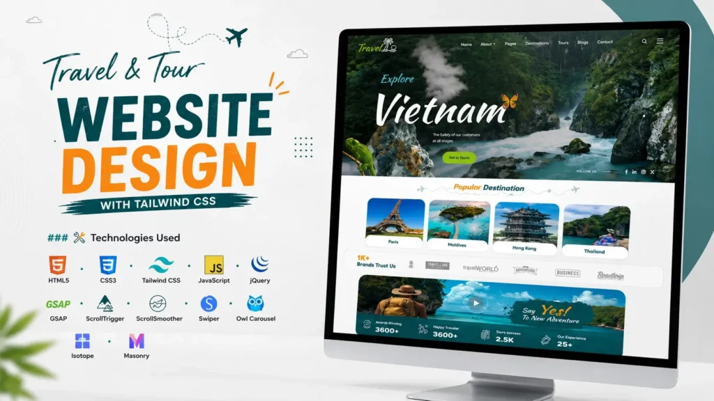
A travel website has to do more than simply display beautiful destinations. It needs to make visitors want to explore, help them find relevant information quickly, and provide a smooth experience across desktop, tablet, and mobile devices. That makes Travel & Tour Website Design an interesting frontend project for developers who want to build something visually attractive while also working with practical UI patterns.
This Travel & Tour website project combines a modern travel-focused interface with HTML5, CSS3, Tailwind CSS, JavaScript, jQuery, GSAP, ScrollTrigger, ScrollSmoother, Swiper, Owl Carousel, and other frontend libraries. The result is a responsive website concept suitable for travel agencies, tour operators, destination platforms, holiday planners, and travel-focused businesses.
The mobile experience is particularly important. StatCounter data shows that mobile devices accounted for more than half of worldwide web platform usage in recent measurements, making responsive website development an essential consideration rather than an optional enhancement.
In this article, we will explore the design, features, technology stack, frontend structure, responsive approach, animation system, and practical ways this Travel & Tour Website Design can be adapted for a real-world website.
What Is a Travel & Tour Website Design?
A Travel & Tour Website Design is a frontend interface created specifically for travel-related businesses and platforms. Unlike a basic business website, a travel website needs to present destinations, packages, experiences, galleries, booking-related information, and calls to action in a visually engaging way.
A strong travel website usually combines:
- Destination-focused visual content
- Tour and holiday packages
- Search or booking interactions
- Attractive calls to action
- Image galleries
- Responsive layouts
- Interactive sliders
- Smooth animations
- Clear navigation
- Mobile-friendly components
The goal is to create an interface where users can quickly understand what the travel business offers and naturally move toward exploring destinations or tour packages.
This project follows that principle by combining visual storytelling with structured frontend components.
Why Modern Travel Website Design Matters
Travel is an extremely visual industry. Users often make an initial decision based on the destination imagery, layout, typography, and overall presentation before reading detailed information.
A cluttered interface can make even a good travel service feel less trustworthy. On the other hand, a clean layout with strong imagery, clear sections, and subtle animations can make a website feel more professional.
There is also an important SEO consideration: Google uses the mobile version of a website’s content for indexing and recommends responsive web design because it is easier to maintain across devices.
That means a modern travel website should be designed with mobile users in mind from the beginning.
Key Features of This Travel & Tour Website Project
The project is more than a simple landing page. Its frontend structure includes several components commonly required in a professional travel website.
Modern Travel-Focused Homepage
The homepage is designed to immediately communicate the travel experience. Large visual areas, destination imagery, navigation elements, calls to action, and content sections work together to create a strong first impression.
For a travel agency, this type of homepage can be used to highlight:
- Popular destinations
- Featured tours
- Seasonal packages
- Travel experiences
- Special offers
- Customer testimonials
- Destination categories
The structure can also be adapted to different travel niches without rebuilding the entire interface.
Responsive Navigation
Navigation is one of the most important elements of any travel website because users need to move between destinations, packages, blogs, galleries, and contact or booking pages.
The project includes responsive navigation behavior designed for different screen sizes.
This is particularly important because Google recommends responsive web design and emphasizes that important content, headings, metadata, and structured data should remain accessible across mobile and desktop experiences.
Destination Sections
Destination-focused sections provide an effective way to organize travel content.
For example, a travel business could categorize destinations into:
- Mountain destinations
- Beach destinations
- Adventure destinations
- Family holidays
- International tours
- Weekend getaways
- Cultural destinations
This structure also creates opportunities for internal linking and topical SEO when converted into a production website.
Tour Package Presentation
Tour packages need more than a title and price. Users usually want to understand what they are getting before taking the next step.
A well-designed package card can include:
- Destination
- Tour duration
- Package name
- Featured image
- Price information
- Short description
- Rating or review information
- View details button
Using reusable cards makes it easier for developers to expand the website as more packages are added.
Image Galleries
Travel websites depend heavily on visual content, so galleries can significantly improve the browsing experience.
The project includes frontend components that support interactive image presentation. Gallery functionality can be used for:
- Destination photographs
- Hotel images
- Tour experiences
- Adventure activities
- Customer travel photographs
- Event highlights
A properly implemented gallery also provides an opportunity to improve image SEO through descriptive filenames, relevant alt text, optimized file sizes, and contextual captions.
Technology Stack Used in the Project
One of the strongest aspects of this project is its combination of core frontend technologies and specialized UI libraries.
| Technology | Purpose |
|---|---|
| HTML5 | Page structure and semantic markup |
| CSS3 | Custom styling and visual presentation |
| Tailwind CSS | Utility-based responsive styling |
| JavaScript | Interactive website functionality |
| jQuery | DOM manipulation and UI interactions |
| GSAP | Advanced animations |
| ScrollTrigger | Scroll-based animation control |
| ScrollSmoother | Smooth scrolling effects |
| Swiper | Touch-friendly sliders |
| Owl Carousel | Carousel-based content sections |
| Isotope | Filtering and dynamic layouts |
| Masonry | Grid-based content layouts |
| Flatpickr | Date-picker functionality |
| noUiSlider | Range and slider controls |
| LightGallery | Image gallery interactions |
| Magnific Popup | Popup and media interactions |
| Font Awesome | Iconography |
This combination allows the project to go beyond static HTML and create a more interactive frontend experience.
Tailwind CSS in the Travel Website
Tailwind CSS is particularly useful for this type of project because travel websites often require multiple responsive layouts and reusable UI patterns.
Instead of writing a separate CSS rule for every small layout adjustment, developers can use utility classes directly within HTML.
For example, a destination card may need different spacing, typography, width, and alignment rules at different breakpoints. Tailwind CSS makes these responsive changes easier to manage.
For developers building a travel website from an existing source code project, this can also make customization faster.
You can modify:
- Colors
- Spacing
- Typography
- Breakpoints
- Card layouts
- Buttons
- Navigation
- Section widths
- Responsive behavior
without completely restructuring the HTML.
GSAP, ScrollTrigger and ScrollSmoother
Static pages can work perfectly well, but carefully implemented motion can make a travel website feel much more immersive.
This project uses GSAP along with ScrollTrigger and ScrollSmoother for animation-related interactions.
GSAP can be used to create effects such as:
- Element reveals
- Image transitions
- Text animations
- Scroll-based movement
- Section transitions
- Entrance animations
- Interactive visual effects
ScrollTrigger is useful when an animation needs to respond to the user’s scroll position.
ScrollSmoother can contribute to a more fluid scrolling experience.
However, animation should support the content rather than compete with it. Excessive movement can distract users, increase page complexity, and potentially affect perceived performance.
Swiper and Owl Carousel for Travel Content
Travel websites frequently need sliders because destinations and packages can contain large amounts of visual content.
The project uses both Swiper and Owl Carousel, which can support different types of interactive content.
Common applications include:
- Destination sliders
- Tour package carousels
- Testimonials
- Image galleries
- Featured experiences
- Blog cards
- Promotional sections
For mobile users, touch-friendly sliders can be especially useful because they allow multiple pieces of content to occupy a relatively small screen area.
Responsive Travel Website Design
Responsive design is one of the most important characteristics of this project.
A visitor might discover a travel website through:
- A smartphone
- A desktop computer
- A tablet
- A search engine
- Social media
- A shared travel link
The interface should remain usable regardless of the device.
Google’s current documentation recommends responsive web design and explains that Google primarily uses the mobile version of website content for indexing.
For developers, that means responsive design should be considered throughout the development process rather than added at the end.
Important areas to test include:
Navigation
Make sure menus remain accessible and easy to use on smaller screens.
Typography
Headings should remain readable without taking over the entire screen.
Images
Large travel images should scale correctly and avoid breaking the layout.
Buttons
Calls to action need enough space for comfortable touch interaction.
Cards
Package and destination cards should stack or resize appropriately.
Sliders
Carousels should remain usable with touch gestures.
SEO Considerations for a Travel Website
A visually attractive frontend is only one part of a successful travel website. The production version should also be optimized for search engines.
Here are some important areas to consider.
Use Semantic HTML
Use meaningful HTML elements such as:
<header><nav><main><section><article><footer>
Semantic structure helps create a clearer relationship between different parts of the page.
Optimize Page Titles and Headings
Each important page should have a unique title and a descriptive H1.
For example:
H1: Travel Packages for Uttarakhand
could be more useful than a generic heading such as:
H1: Welcome
Optimize Travel Images
Images are central to travel websites, but large unoptimized images can negatively affect page performance.
Use appropriately sized images and descriptive alt text.
Instead of:
image1.jpg
a meaningful filename might be:
kedarnath-travel-guide.jpg
Build Internal Links
A travel website can naturally develop a strong internal linking structure.
For example:
Destination → Tour Package → Travel Guide → Booking Page
This creates a useful journey for both users and search engines.
Create Dedicated Destination Pages
Rather than putting every destination on a single page, consider creating dedicated pages for important locations.
A destination page could contain:
- Overview
- Best time to visit
- Things to do
- Places to stay
- How to reach
- Tour packages
- FAQs
- Related destinations
This creates opportunities to target specific search intent.
What Makes This Project Different?
Many website showcase pages focus only on how attractive the homepage looks. A more useful approach is to consider how the design could become a functional travel website.
That is where this project provides practical value.
1. It Is Built Around Reusable UI Patterns
Destination cards, package sections, sliders, navigation components, and content blocks can be adapted for different travel businesses.
2. It Combines Design With Interaction
The use of GSAP, sliders, galleries, and interactive components makes the project more than a collection of static screens.
3. It Can Be Adapted to Different Travel Niches
The same frontend concept could be customized for:
- Travel agencies
- Tour operators
- Adventure companies
- Holiday planners
- Destination websites
- Hotel and resort businesses
- Trekking companies
- Tourism startups
4. The Source Code Helps Developers Understand the Structure
Looking at a complete frontend project can be more useful than studying isolated code snippets.
Developers can understand how HTML, CSS, JavaScript, Tailwind utilities, plugins, assets, and interactions work together.
How Beginners Can Customize the Travel Website
If you are new to frontend development, avoid changing everything at once.
Start with the most visible elements.
Step 1: Update Branding
Change the logo, website name, colors, and typography.
Step 2: Replace Destination Images
Use properly optimized images relevant to your travel business.
Step 3: Modify Navigation
Update menu labels and links according to your website structure.
Step 4: Customize Tour Cards
Replace demo destinations and package information with your own content.
Step 5: Update Calls to Action
Use clear actions such as:
- Explore Destinations
- View Tour Packages
- Plan Your Trip
- Contact Our Team
- View Details
Step 6: Test Every Breakpoint
Check the website on desktop, tablet, and mobile.
Do not assume that a desktop layout will automatically look perfect on a smartphone.
How to Use the Source Code for a Real Project
Before publishing a source-code project as a production website, developers should review the complete codebase instead of simply uploading the files.
Check:
- Asset paths
- CSS dependencies
- JavaScript dependencies
- Font files
- Plugin versions
- Image sizes
- Broken links
- Form functionality
- Mobile navigation
- Slider behavior
- Console errors
- SEO metadata
- Accessibility
- Performance
This step is often overlooked.
A website can look perfect in a browser while still containing broken assets, unnecessary scripts, missing metadata, or non-functional links.
Performance Tips for Travel Websites
Travel websites often contain many high-resolution photographs, which can become a major performance bottleneck.
Consider these improvements:
Compress images: Use modern image formats where appropriate.
Lazy-load secondary images: Avoid loading every below-the-fold image immediately.
Reduce unnecessary JavaScript: Only load functionality that the page actually needs.
Optimize animations: Keep complex animations controlled and purposeful.
Use browser caching: Configure caching appropriately for static assets.
Minify production assets: Reduce unnecessary CSS and JavaScript overhead.
Test Core Web Vitals: Check loading, responsiveness, and visual stability on real pages.
A beautiful travel website should not force users to wait unnecessarily before they can explore destinations.
Where to Add a Video Showcase
A project showcase video can make the page considerably more useful because visitors can see the interface in action before examining the source code.
For example, you can showcase:
- Homepage animation
- Navigation interactions
- Destination sections
- Package sliders
- Responsive behavior
- Code structure
A short video can demonstrate the overall design much faster than a collection of screenshots.
For a source-code website, the ideal video should show the finished frontend first and then briefly show the underlying code. This gives visitors both visual context and technical context.
Who Can Use This Travel Website Project?
This type of Travel & Tour Website Design can be useful for several audiences.
Frontend Developers
Developers can study the relationship between HTML, Tailwind CSS, JavaScript, animations, and third-party UI libraries.
Web Design Students
Beginners can use the project to understand how a complete website is organized rather than learning from disconnected examples.
Travel Businesses
Travel companies can use the design concept as a starting point for building their own branded website.
Freelancers
Freelancers can adapt the UI structure for travel agency and tourism projects.
UI/UX Designers
Designers can use the layout as inspiration for destination cards, package presentation, galleries, and travel landing pages.
Frequently Asked Questions
What is a Travel & Tour Website Design?
A Travel & Tour Website Design is a website interface created for travel agencies, tour operators, tourism platforms, and travel businesses. It typically includes destinations, tour packages, galleries, travel information, calls to action, and responsive layouts.
Which technologies are used in this Travel & Tour Website Design?
The project uses HTML5, CSS3, Tailwind CSS, JavaScript, jQuery, GSAP, ScrollTrigger, ScrollSmoother, Swiper, Owl Carousel, Isotope, Masonry, Flatpickr, noUiSlider, LightGallery, and other frontend libraries.
Is this Travel & Tour Website responsive?
The project is structured around responsive frontend techniques so that the interface can adapt to desktop, tablet, and mobile screen sizes. The production implementation should still be tested across the devices and browsers relevant to the target audience.
Can beginners understand the source code?
Yes. Beginners can study the project section by section, starting with the HTML structure and Tailwind CSS classes before moving into JavaScript and animation files.
Can I customize the Travel & Tour Website Design?
Yes. The interface can be customized by changing the branding, colors, images, typography, navigation, destination information, tour packages, calls to action, and other content.
Can this design be used for a travel agency website?
The frontend structure is suitable as a starting point for a travel agency, tour operator, tourism company, trekking business, holiday planner, or destination-focused website. Production use should include the required backend, booking, payment, forms, database, and business functionality.
Why is responsive design important for a travel website?
Travel users frequently browse destinations and packages on smartphones. Google also uses the mobile version of website content for indexing and recommends responsive web design.
Final Thoughts
A successful Travel & Tour Website Design needs to balance visual appeal, usability, responsiveness, performance, and maintainable code.
This project brings those ideas together through Tailwind CSS, HTML5, CSS3, JavaScript, jQuery, GSAP, ScrollTrigger, ScrollSmoother, Swiper, Owl Carousel, and other frontend technologies.
For beginners, it provides an opportunity to study how a complete travel interface is structured. For experienced developers, it offers a practical foundation that can be adapted into a more specialized tourism, travel agency, or tour-booking website.
The biggest lesson is that good travel website design is not simply about adding attractive destination photographs. The interface should guide users from discovering a destination to exploring a package and taking the next action.
When the visual design, responsive layout, frontend performance, SEO structure, and user journey work together, a travel website becomes much more than a collection of attractive pages—it becomes a useful digital experience for travelers.
Related Templates You May Like
17 people bought this
Grab it Now for Just 499 ₹999