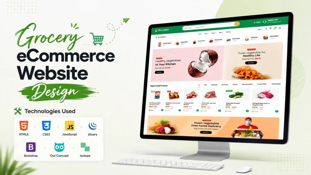
Building a grocery shopping website is no longer just about placing product images on a page and adding a shopping cart. Modern customers expect a smooth browsing experience, clear categories, attractive product presentation, responsive layouts, promotional sections, search functionality and an interface that feels trustworthy from the first screen.
That is exactly where a well-planned Grocery eCommerce Website Design can make a difference.
This grocery eCommerce project combines a modern online grocery storefront with a structured front-end built using HTML5, CSS3, JavaScript, jQuery, Bootstrap, Owl Carousel and Isotope. The homepage brings together grocery categories, product listings, promotional banners, shopping sections, offers, news content and responsive interface elements in one complete UI.
The timing is also relevant. According to the U.S. Census Bureau, e-commerce accounted for 17.1% of total U.S. retail sales in Q2 2026, while e-commerce sales increased 12.2% compared with the same quarter of 2025. That broader growth shows why businesses continue to invest in digital shopping experiences.
For grocery businesses, the opportunity is particularly interesting because customers frequently purchase everyday products and value convenience, product discovery and easy ordering.
In this article, we will explore the design, features, technology stack, page structure and practical ways this Grocery eCommerce Website Design can be adapted for a real online grocery store.
What Is a Grocery eCommerce Website Design?
A grocery eCommerce website is a digital storefront designed specifically for selling everyday food and household products online.
Unlike a simple business website, an online grocery store needs to handle a much larger product catalogue. Users should be able to browse categories, discover products, compare items, view offers and eventually move toward checkout with minimal friction.
A strong grocery website design therefore needs to balance three things:
- Product discovery
- Visual appeal
- Ease of navigation
This project follows that approach by creating a homepage that behaves more like a complete online shopping interface than a simple promotional landing page.
The layout includes grocery categories such as fresh fruit, raw meat, fish and seafood, organic vegetables, chocolate and candy, soft drinks, milk and dairy, eggs and protein, tea and coffee, and snacks.
This category-first structure is particularly useful for grocery stores because visitors often know the type of product they want before they know the exact product name.
Why a Modern Grocery Store Website Matters
The grocery industry is strongly connected to convenience.
Customers may want to order their weekly groceries, purchase fresh vegetables, compare products or quickly reorder commonly purchased items. A confusing website can make even a simple purchase feel difficult.
Research from McKinsey’s 2026 State of Grocery in North America found that 70% of surveyed consumers prefer delivery as their online grocery fulfilment model, with convenience and time savings among the major reasons.
This highlights an important design principle: a grocery website should reduce unnecessary steps.
The interface should make it easy for visitors to answer questions such as:
- What products are available?
- Which category contains the product?
- What are the current offers?
- Which products are popular?
- How can I search?
- Where can I view my cart?
- How do I continue shopping?
A well-organized homepage can answer many of these questions before the visitor even reaches a product detail page.
Key Features of This Grocery eCommerce Website Design
1. Category-Based Grocery Navigation
One of the strongest elements of this project is its category navigation system.
The interface presents categories including:
- Fresh Fruit
- Raw Meat
- Fish & Seafood
- Organic Vegetables
- Chocolate Candy
- Soft Drinks
- Milk & Dairy
- Eggs & Protein
- Tea & Coffee
- Snacks
The category navigation also contains product-level information and links toward shop detail pages.
This creates a useful browsing hierarchy:
Category → Product → Product Details → Shopping Action
For grocery websites with a large inventory, this hierarchy can help users understand the catalogue quickly.
2. Product Search Interface
The header includes a dedicated search area with a category selector and product search field.
This is an important feature because grocery stores can contain hundreds or thousands of products.
Instead of forcing visitors to scroll through multiple sections, search allows users to move directly toward their intended product.
For a production website, the front-end search interface can later be connected to a backend search system, database or eCommerce platform.
3. Responsive Header Design
The header combines several important shopping functions in one area.
It includes:
- Brand logo
- Product search
- Category selector
- Language selector
- Customer support information
- Navigation
- Shopping-related links
The CSS structure also includes a dedicated responsive stylesheet, making the project easier to adapt across desktop, tablet and mobile screen sizes.
This is important because grocery shoppers may access an online store from a desktop computer, smartphone or tablet.
4. Promotional Banner Sections
The homepage includes large promotional areas designed to immediately communicate product categories and offers.
Examples include sections promoting vegetables, fresh fruits and other grocery products.
A promotional banner can do more than decorate the homepage. It can direct attention toward:
- Seasonal products
- Featured categories
- New arrivals
- Special campaigns
- Popular products
- Limited-time promotions
For a real grocery business, these areas could be connected to dynamic campaign data rather than static HTML content.
5. Best-Selling Product Sections
The project includes a Highest Sold Products section that displays product cards with names, imagery and pricing.
This type of section is useful because customers often rely on social proof and popularity when deciding what to purchase.
The project demonstrates products such as dry fruits, meat, vegetables and other grocery items.
For a production website, the same section could be dynamically populated using sales data from the store database.
6. Multiple Grocery Product Categories
The homepage does not rely on a single product grid.
Instead, it separates products into different shopping themes, including fresh fruits, fresh meat and snacks.
This makes the homepage more useful for visitors who prefer browsing instead of searching.
For example, a visitor interested in fresh fruit can move directly into a fruit-focused section rather than browsing unrelated products.
That is a small UX decision, but it can significantly improve product discovery.
Technology Stack Used in the Project
The project uses a combination of established front-end technologies.
| Technology | Purpose |
|---|---|
| HTML5 | Page structure and semantic content |
| CSS3 | Layout, styling and visual presentation |
| JavaScript | Interactive website behaviour |
| jQuery | DOM manipulation and UI functionality |
| Bootstrap | Responsive layout and interface components |
| Owl Carousel | Product and content sliders |
| Isotope | Filtering and dynamic product layouts |
| Font Awesome | Interface and navigation icons |
| Nice Select | Enhanced select/dropdown interface |
| Fancybox | Interactive media/lightbox functionality |
Using these technologies together makes the project suitable as a front-end foundation for an online grocery store.
The code is also separated into modular CSS files such as header, banner, shop, offers, news, footer and responsive styles. That organization can make future customization easier than keeping every style inside one oversized stylesheet.
Understanding the Project Structure
Another useful aspect of this grocery website project is its organized asset structure.
The project contains an index.html homepage along with dedicated CSS and JavaScript assets.
The stylesheet structure includes files for areas such as:
- Header
- Featured content
- Banner
- Shop
- Advertisements
- CTA sections
- Offers
- News
- Highlights
- Footer
- Responsive behaviour
This modular approach is valuable for beginners because it makes it easier to locate the code responsible for a particular section.
For example, if you want to modify the header, you can inspect the header-related CSS rather than searching through an entire stylesheet.
Likewise, responsive behaviour can be reviewed separately from the main desktop styles.
Homepage Sections Explained
The homepage follows a logical eCommerce flow.
Header and Search
The visitor first encounters branding, search and navigation functionality.
The search interface allows users to select a product category and enter a search term.
Grocery Categories
The category area introduces the primary grocery departments.
This is particularly useful for shoppers who want to browse products instead of searching by name.
Featured Products
Featured products provide visual entry points into important parts of the catalogue.
Promotional Banners
Large banners create visual hierarchy and provide space for campaigns, seasonal messaging and product promotions.
Highest Sold Products
Popular products are highlighted to help visitors discover commonly purchased items.
Fresh Fruits and Vegetables
Dedicated sections focus on important grocery departments and allow product imagery to become the primary navigation mechanism.
Fresh Meat
The project includes a dedicated meat section with individual products and pricing.
Snacks
The snacks section introduces packaged food products and provides another category-based shopping experience.
Upcoming Offers
An offers section gives the homepage a promotional layer that can be adapted for seasonal campaigns, weekly grocery promotions or special events.
Latest News
The homepage also includes a news section. This is particularly useful from an SEO perspective because a grocery business can use content marketing to publish recipes, food guides, product information and shopping advice.
How to Customize This Grocery Website Template
One of the biggest advantages of starting with an existing front-end project is that you do not need to design every component from scratch.
However, customization should be planned rather than limited to changing colours and images.
Replace the Branding
Start by replacing the existing logo, company name and brand assets.
Use a consistent visual identity across:
- Logo
- Buttons
- Headings
- Product labels
- Navigation
- Promotional banners
Update Product Categories
Replace the demonstration categories with the actual categories used by your grocery business.
For example:
- Fruits & Vegetables
- Dairy Products
- Bakery
- Meat & Seafood
- Beverages
- Snacks
- Household Essentials
The exact category structure should match your inventory rather than simply copying a generic grocery catalogue.
Replace Product Images
High-quality product images are extremely important for an online grocery store.
Use consistent image dimensions and backgrounds wherever possible.
This creates a cleaner product grid and makes the website feel more professional.
Connect the Front End to a Backend
The supplied project is primarily a front-end interface.
To turn it into a fully operational online store, you can connect it with a backend system for:
- User accounts
- Product inventory
- Product search
- Shopping cart
- Orders
- Payments
- Delivery management
- Product reviews
- Admin management
The existing UI can serve as the visual foundation while backend functionality is developed separately.
SEO Considerations for a Grocery Website
A visually attractive website is only one part of an effective online store.
Search engine optimization should be considered from the beginning.
Use Descriptive Page Titles
Each important page should have a unique title.
For example:
Organic Vegetables Online | Your Grocery Store
is more descriptive than:
Shop Page
Optimize Product Names
Product titles should describe what the customer is actually searching for.
Instead of:
Product 01
use:
Fresh Organic Carrots 1 KG
Specific product naming improves both usability and search relevance.
Create Category Landing Pages
Each major grocery category can have its own optimized page.
Examples include:
- Fresh Fruit
- Organic Vegetables
- Meat and Fish
- Dairy Products
- Snacks
- Beverages
Each page can target a different search intent while maintaining the same website design.
Add Useful Content
The project already includes a news/blog section, which creates an opportunity to build topical authority.
A grocery website could publish content such as:
- Best vegetables for a healthy diet
- How to store fresh fruits
- Weekly grocery shopping checklist
- Guide to buying fresh meat
- Healthy snack ideas
- Seasonal fruit guides
- Grocery shopping tips
The goal should not be publishing articles simply to add keywords. Content should answer genuine customer questions.
A Detail Competitors Often Miss: Design the Homepage Around Shopping Intent
Many grocery website templates focus heavily on visual design but overlook how different visitors behave.
Not every visitor arrives with the same intent.
Some users know exactly what they want.
Others want inspiration.
Some are looking for promotions.
Others want to browse a particular category.
A stronger homepage therefore provides multiple paths:
Search → Find a specific product
Categories → Browse a department
Best Sellers → Discover popular products
Offers → Find promotions
Content → Learn before purchasing
This is one of the most useful principles you can take from the project.
A successful grocery eCommerce website should not force every visitor through the same journey.
Another Important Insight: Mobile UX Should Influence Desktop Design
Responsive design should not be treated as an afterthought.
Grocery shopping is naturally suited to mobile devices because customers may browse products while travelling, sitting at home or preparing a shopping list.
Therefore, important elements should remain easy to access on smaller screens.
The mobile version should prioritize:
- Search
- Categories
- Product images
- Product names
- Prices
- Cart access
- Clear buttons
- Simple navigation
The project’s responsive CSS provides a foundation for adapting the interface across screen sizes, but a production implementation should still be tested on actual devices.
Using the Source Code for Your Own Grocery Project
If you are a beginner learning front-end development, this project can also be useful as a practical reference.
Instead of studying isolated HTML and CSS examples, you can examine how a complete website combines multiple sections into one interface.
A useful learning approach is to inspect the project in stages:
- Open
index.html. - Identify the major homepage sections.
- Find the CSS file responsible for each section.
- Review the responsive styles.
- Inspect the JavaScript functionality.
- Change one component at a time.
- Test the result in the browser.
- Gradually replace demonstration content with your own content.
This method helps you understand how real-world front-end projects are structured.
Why This Project Works as a Grocery Website Starting Point
The biggest strength of this Grocery eCommerce Website Design is its breadth.
It is not limited to a single hero section or a basic product grid.
The homepage demonstrates many components required by a modern grocery storefront:
- Category navigation
- Product search
- Product cards
- Promotional banners
- Best-selling products
- Fresh food sections
- Offers
- News
- Shopping navigation
- Cart and checkout links
- Responsive styling
- Supporting JavaScript interactions
That makes it more useful as a practical project reference than a simple visual mockup.
The next step is connecting the interface to real business logic and data.
Final Thoughts
A successful grocery website needs more than attractive colours and product images. It needs a structure that helps customers discover products quickly, understand categories, recognize offers and move naturally toward purchasing.
This Grocery eCommerce Website Design provides a strong front-end foundation for that purpose.
Built with HTML5, CSS3, JavaScript, jQuery, Bootstrap, Owl Carousel and Isotope, the project demonstrates how a complete grocery storefront can be organized into reusable sections and components.
For developers, it offers a practical way to study a real-world eCommerce interface. For designers, it provides ideas for grocery category navigation, product presentation and promotional layouts. For businesses, it can serve as a starting point for developing a customized online grocery shopping experience.
The most important lesson is simple: a grocery website should be designed around the customer’s shopping journey, not just around how the homepage looks.
When search, categories, products, promotions, content and responsive usability work together, the website becomes much more than a collection of UI sections—it becomes a practical digital shopping experience.
Frequently Asked Questions
What is a Grocery eCommerce Website Design?
A Grocery eCommerce Website Design is a website interface created specifically for selling grocery products online. It typically includes product categories, search, product listings, promotional sections, shopping navigation and responsive layouts.
Which technologies are used in this grocery website project?
The project uses HTML5, CSS3, JavaScript, jQuery, Bootstrap, Owl Carousel and Isotope. It also includes supporting libraries and modular CSS files for different website sections.
Is this Grocery eCommerce Website responsive?
Yes. The project includes responsive CSS and Bootstrap-based layout components designed to adapt the interface to different screen sizes. For a production website, additional testing across current mobile and tablet devices is recommended.
Can I customize the grocery website design?
Yes. The HTML, CSS and JavaScript structure can be customized to change branding, colours, product categories, images, text, banners and other visual elements.
Can this source code be connected to a backend?
Yes. The front-end can be integrated with a backend, database or eCommerce system to support real product data, customer accounts, shopping carts, orders, payments and inventory management.
Is this grocery website suitable for an online supermarket?
The front-end design is suitable as a starting point for an online supermarket, grocery store, fresh food business or similar eCommerce project. Additional backend and business functionality would be required for a complete production store.
How can I improve the SEO of a grocery eCommerce website?
Start with descriptive page titles, optimized category pages, useful product names, clean URLs, unique product descriptions, structured internal linking, image optimization and helpful informational content. Technical performance and mobile usability should also be treated as important SEO considerations.
Why are grocery categories important for eCommerce UX?
Categories reduce the amount of effort required to find products. A well-organized category system allows visitors to browse departments such as fruits, vegetables, meat, dairy and snacks without relying entirely on site search.
Can I use the project to learn HTML and CSS?
Yes. Because the project contains a complete homepage and separate styling modules, beginners can study individual sections and see how HTML structure, CSS styling, responsive rules and JavaScript interactions work together.
What should I add before launching a real grocery store website?
A production implementation should typically include a working product database, authentication, shopping cart, checkout, payment integration, order management, inventory management, delivery functionality, security measures, analytics and proper SEO configuration.
Video Preview:-
Related Templates You May Like
1 people bought this
Grab it Now for Just 499 ₹999